Correcting the symbol of medicine—and making it specific to surgery.
The Association of General Surgeons of Sri Lanka needed more than a cleaner logo. Its existing mark used medically inaccurate symbolism and lacked a clear relationship to surgical practice. I redesigned the identity around the single-snake Rod of Asclepius, integrated scalpel forms and classical olive branches, then developed a flexible system for AGSSL's official documentation and communications.
From client brief and symbolic review to an approved identity system
Strategy, symbolic development, visual design and final production
Primary seal, vertical identifier and horizontal organisational lockup
The identity is used across AGSSL's official documentation
Section 1 of 10Overview
Overview
An identity correction with institutional consequences.
AGSSL represents general surgeons in Sri Lanka. Its emblem therefore needed to communicate medical legitimacy, surgical relevance and organisational authority. The previous logo could not do that reliably because the central medical symbol was incorrect and the composition was difficult to reproduce consistently.
Correct and modernise
Replace inaccurate medical symbolism while preserving the gravitas expected of a national professional association.
Make medicine surgical
Build a distinct connection to general surgery without making the emblem decorative or overly literal.
Create a usable system
Provide formats that could work across seals, document headers and wider organisational communications.
Context
The mark needed to carry professional meaning before it carried style.
For a medical association, an emblem is not simply a visual signature. It appears in formal contexts where symbolic credibility matters. AGSSL's redesign therefore began with the meaning of the mark: which medical tradition it referenced, how it represented surgeons and how clearly it could identify the association.
Authority without visual heaviness
The identity needed to feel established and serious, but remain clear enough for contemporary documents, digital headers and repeated organisational use.
Move toward AGSSL blue
An early colour direction referenced the Sri Lankan flag. The client preferred a more focused blue identity that felt specific to AGSSL and more appropriate for its official materials.
A Sri Lankan-colour direction was tested before the final blue system.
The exploratory seal and horizontal lockup used colours associated with Sri Lanka. Client feedback moved the approved identity toward a focused blue palette that was calmer, more reproducible and better suited to official documentation.
The redesign question was not “How can the old badge look newer?” It was “What symbol should a Sri Lankan association of general surgeons stand behind?”
Symbol audit
The original emblem contained a foundational medical error.
The central motif resembled the caduceus: a winged staff associated with Hermes and commonly depicted with two snakes. The historically recognised medical emblem is the Rod of Asclepius, which uses one snake and no wings. Correcting that distinction became the non-negotiable starting point.
Incorrect medical symbolism
The double-snake, winged staff was not the correct emblem for medicine and weakened the association's symbolic credibility.
No specific connection to surgery
The previous mark referenced healthcare broadly but did not visually distinguish a professional body for general surgeons.
Fragile peripheral typography
Small text followed inconsistent curves around the emblem, creating legibility and reproduction problems at reduced sizes.
Limited identity flexibility
The old composition functioned as a single badge rather than a family of lockups for different document proportions.
Design brief
Four criteria guided every design decision.
Be medically accurate
Use the single-snake Rod of Asclepius rather than the caduceus.
Represent surgery
Introduce a direct but dignified reference to the tools and precision of surgical practice.
Feel institutional
Create a formal, established emblem suitable for a national professional association.
Scale as a system
Support standalone, vertical and horizontal applications without rebuilding the identity each time.
Symbol design
Each element was chosen to do a specific job.
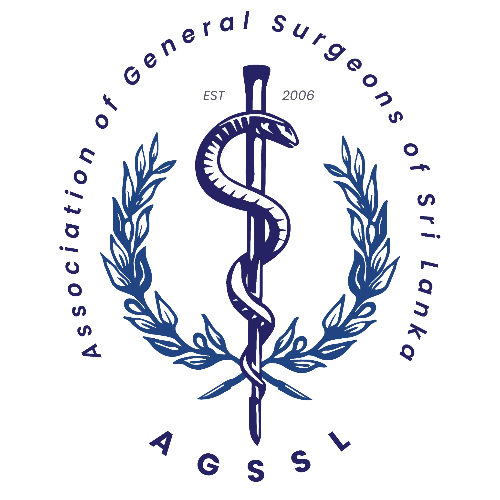
The final emblem is intentionally compact, but its meaning is layered. It combines the correct medical tradition with a direct surgical reference and a classical visual language appropriate to an established professional body.
Rod of Asclepius
A single snake around a staff restores the historically recognised symbol of medicine and healing.
Scalpel construction
The central staff is shaped through scalpel-inspired forms, making the mark specific to surgeons rather than medicine in general.
Olive branches
The wreath references the Greek lineage of Asclepius while adding balance, distinction and ceremonial authority.
Institutional ring
The association name, establishment year and AGSSL abbreviation complete the mark as a formal organisational seal.
Development
Refinement focused on meaning, hierarchy and client alignment.
Because the client brief was clear, the project did not require an extended discovery phase. Development centred on correcting the core symbol, testing how strongly the mark should reference Sri Lanka, refining the surgical motif and selecting a colour direction that felt owned by AGSSL.
| Decision | Initial risk or direction | Final resolution |
|---|---|---|
| Medical symbol | Retaining the familiar double-snake staff would preserve a recognisable but inaccurate convention. | Rebuilt the emblem around one snake and a wingless Rod of Asclepius. |
| Surgical relevance | A generic staff would correct the symbol but still say little about general surgery. | Integrated scalpel-shaped geometry into the central staff. |
| Heritage | Flag-derived colours introduced too many competing associations. | Kept heritage in the classical olive wreath rather than relying on national colours. |
| Colour | An early Sri Lankan flag palette made the mark feel less specific to the association. | Consolidated the system around AGSSL's preferred blue. |
| Formats | A single circular badge would be restrictive in wide document headers. | Created seal, vertical and horizontal configurations. |
Identity system
One emblem, three dependable configurations.
The finished identity was designed as a small system rather than a solitary logo. Each configuration keeps the same symbolic centre while adapting the information hierarchy to the available space.
The seal carries recognition; the lockup carries explanation.
The emblem can stand alone where AGSSL is already understood. When context is needed, the abbreviation and full association name create a clear reading sequence without altering the symbol itself.
- Single-colour construction for dependable reproduction
- Balanced proportions for stamps and document marks
- Horizontal option for headers and wide layouts
- Consistent blue across every configuration
Application
The system was built for repeated institutional use.
AGSSL needed an identity that would remain consistent when used by different people across formal materials. The final suite creates simple rules for choosing the right configuration rather than forcing every application into the same shape.
Use the circular emblem for centred, ceremonial or stamp-like applications.
Pair the emblem with AGSSL where a compact organisational signature is required.
Use the complete name in document headers and wide-format communications.
Official documentation
The approved identity is now used across AGSSL's formal organisational documents and associated materials.
Clarity over decoration
The one-colour system avoids fragile effects, simplifies reproduction and keeps the medical symbol legible.
Outcome
The association gained a symbol it could use with confidence.
The final result corrected the emblem's medical foundation, made the identity relevant to surgeons and provided AGSSL with a more coherent system for official use. Its value is visible in adoption rather than speculative performance figures.
Medical symbolism
The single-snake Rod of Asclepius replaced the inaccurate caduceus-style motif.
Supported by the before-and-after identity artifacts.Surgical identity
Scalpel forms gave the association a direct visual connection to general surgery.
Design rationale embedded in the approved central emblem.Institutional adoption
The redesigned identity is used across AGSSL's official documentation.
Client-adopted outcome; no unsupported commercial metric is claimed.Reflection
The most important logo decision happened before drawing.
This project reinforced that visual identity work can require subject-matter correction, not only aesthetic refinement. Once the difference between the caduceus and the Rod of Asclepius was treated as a design requirement, every later decision became clearer: one snake, no wings, surgical specificity and an authoritative system that could withstand formal use.
Accuracy is part of brand trust
For professional bodies, an incorrect symbol can undermine credibility regardless of visual polish.
Specificity creates distinction
The scalpel transformed a generic medical emblem into an identity relevant to surgeons.
A logo should arrive as a system
Multiple lockups made adoption easier than delivering one composition and leaving every future use unresolved.
The redesign succeeded because it did not merely make AGSSL look newer. It gave the association a mark that was medically accurate, surgically relevant and institutionally usable.
Need a guided walkthrough of the work and decision-making?
Start a conversation